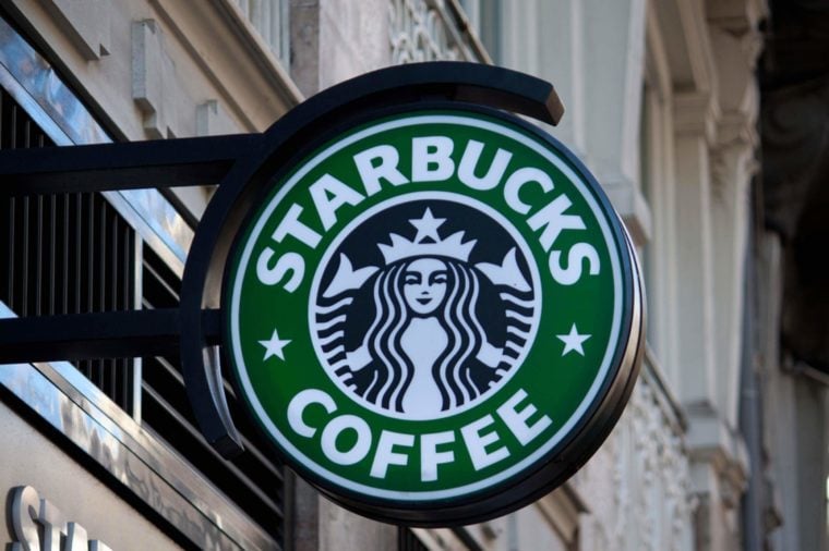
Some like their coffee bold and black, while others take it sweet and sugary. No matter your preference, though, you’re probably familiar with the famous Starbucks logo. Catch sight of the green Siren with her long, wavy hair, and you’re instantly transported to latte-with-extra-whipped-cream heaven.
But there is a surprising hidden detail on this iconic logo—and you’ve probably never noticed it before. According to the team that redesigned the image in 2011, one last-minute decision made all the difference. (You’ll be surprised at what Starbucks was almost called, too.)
The original Starbucks logo was somewhat crudely designed; it had been made from a wood carving, Co.Design reports. So when the image was revamped in 2011, the designers wanted to make the logo cleaner and crisper. They decided to smooth out all of the Siren’s imperfections, making her face more symmetrical in the process. However, after several attempts, the team was still not satisfied.
“As a team, we were like, ‘There’s something not working here, what is it?’” global creative director Connie Birdsall told Co.Design. “It was like, ‘Oh, we need to step back and put some of that humanity back in. The imperfection was important to making her really successful as a mark.”
Although you might not see it right away, there is a slight asymmetry in the Siren’s face to this day. Look closely: You’ll notice that the right side of her face has a bit more shadow, and her nose dips slightly lower on the right than the left. “It felt a bit more human and felt less like a perfectly cut mask,” design partner Bogdan Geana said.
By the way, did you know Apple used to have Sir Isaac Newton in its logo? Find out what other famous company logos looked like back in the day.
[Source: Extra Crispy]
The post The Hidden Detail on the Starbucks Logo You Never Noticed Before appeared first on Reader's Digest.
from Reader's Digest http://ift.tt/2DzJL5j
ليست هناك تعليقات:
إرسال تعليق